Introducing the React Profiler
React 16.5 adds support for a new DevTools profiler plugin. This plugin uses React’s experimental Profiler API to collect timing information about each component that’s rendered in order to identify performance bottlenecks in React applications. It will be fully compatible with our upcoming time slicing and suspense features.
This blog post covers the following topics:
Profiling an application
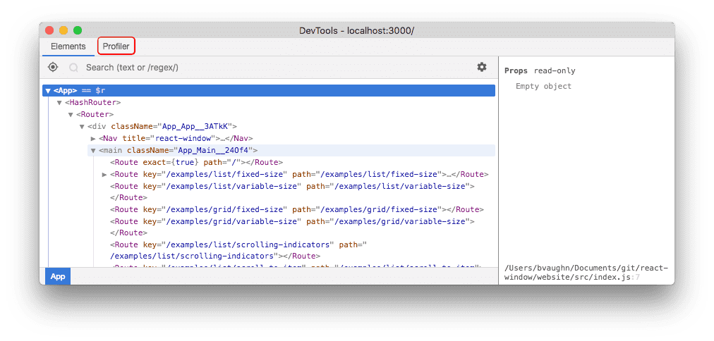
DevTools will show a “Profiler” tab for applications that support the new profiling API:
Note:
react-dom16.5+ supports profiling in DEV mode. A production profiling bundle is also available asreact-dom/profiling. Read more about how to use this bundle at fb.me/react-profiling
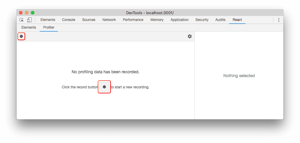
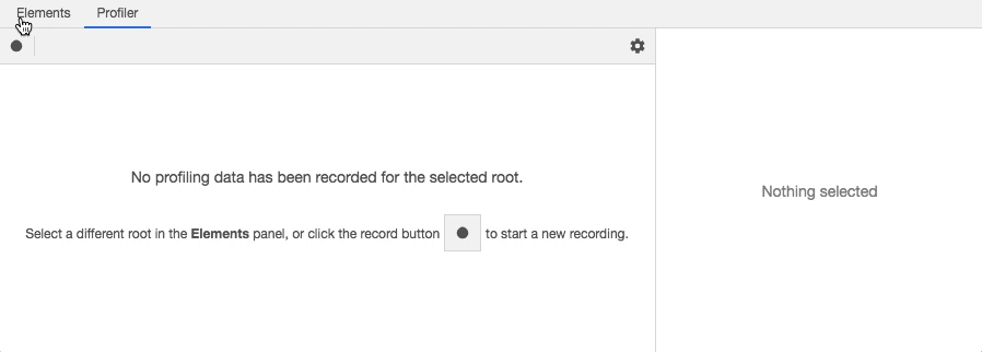
The “Profiler” panel will be empty initially. Click the record button to start profiling:
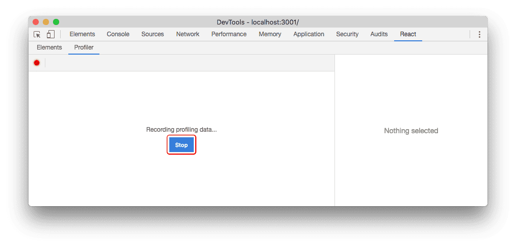
Once you’ve started recording, DevTools will automatically collect performance information each time your application renders. Use your app as you normally would. When you are finished profiling, click the “Stop” button.
Assuming your application rendered at least once while profiling, DevTools will show several ways to view the performance data. We’ll take a look at each of these below.
Reading performance data
Browsing commits
Conceptually, React does work in two phases:
- The render phase determines what changes need to be made to e.g. the DOM. During this phase, React calls
renderand then compares the result to the previous render. - The commit phase is when React applies any changes. (In the case of React DOM, this is when React inserts, updates, and removes DOM nodes.) React also calls lifecycles like
componentDidMountandcomponentDidUpdateduring this phase.
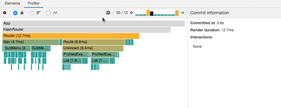
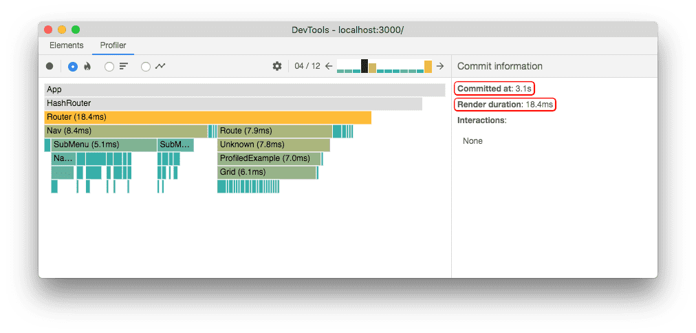
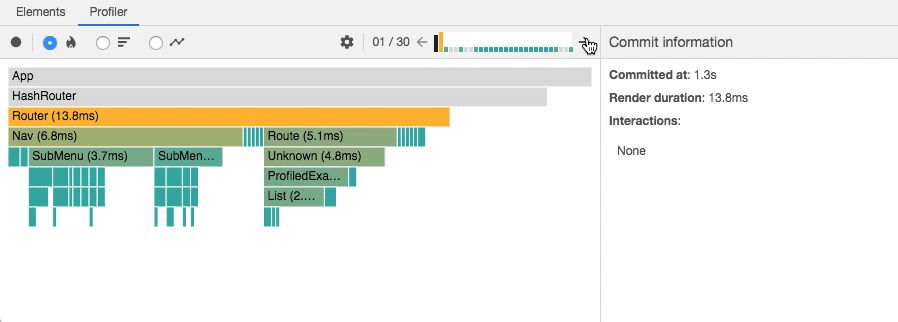
The DevTools profiler groups performance info by commit. Commits are displayed in a bar chart near the top of the profiler:

Each bar in the chart represents a single commit with the currently selected commit colored black. You can click on a bar (or the left/right arrow buttons) to select a different commit.
The color and height of each bar corresponds to how long that commit took to render. (Taller, yellow bars took longer than shorter, blue bars.)
Filtering commits
The longer you profile, the more times your application will render. In some cases you may end up with too many commits to easily process. The profiler offers a filtering mechanism to help with this. Use it to specify a threshold and the profiler will hide all commits that were faster than that value.
Flame chart
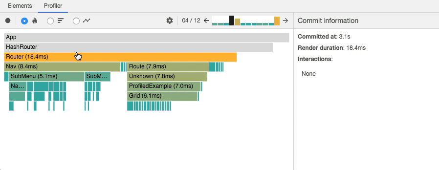
The flame chart view represents the state of your application for a particular commit.
Each bar in the chart represents a React component (e.g. App, Nav).
The size and color of the bar represents how long it took to render the component and its children.
(The width of a bar represents how much time was spent when the component last rendered and the color represents how much time was spent as part of the current commit.)
Note:
The width of a bar indicates how long it took to render the component (and its children) when they last rendered. If the component did not re-render as part of this commit, the time represents a previous render. The wider a component is, the longer it took to render.
The color of a bar indicates how long the component (and its children) took to render in the selected commit. Yellow components took more time, blue components took less time, and gray components did not render at all during this commit.
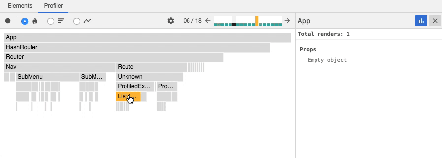
For example, the commit shown above took a total of 18.4ms to render.
The Router component was the “most expensive” to render (taking 18.4ms).
Most of this time was due to two of its children, Nav (8.4ms) and Route (7.9ms).
The rest of the time was divided between its remaining children or spent in the component’s own render method.
You can zoom in or out on a flame chart by clicking on components:

Clicking on a component will also select it and show information in the right side panel which includes its props and state at the time of this commit.
You can drill into these to learn more about what the component actually rendered during the commit:
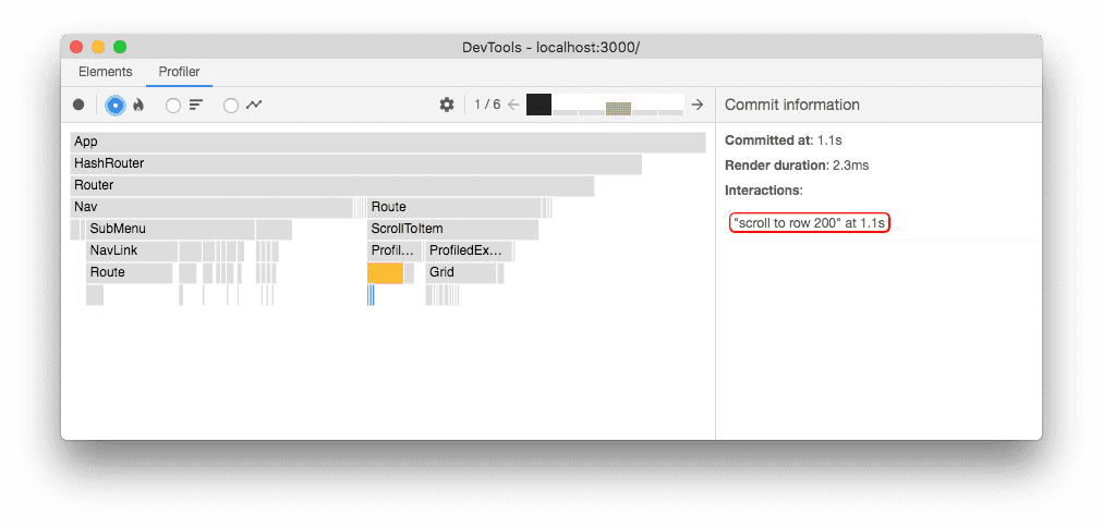
In some cases, selecting a component and stepping between commits may also provide a hint as to why the component rendered:
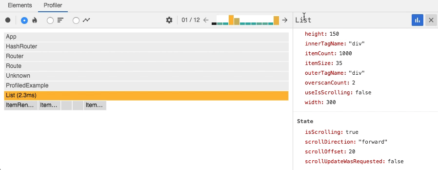
The above image shows that state.scrollOffset changed between commits.
This is likely what caused the List component to re-render.
Ranked chart
The ranked chart view represents a single commit.
Each bar in the chart represents a React component (e.g. App, Nav).
The chart is ordered so that the components which took the longest to render are at the top.

Note:
A component’s render time includes the time spent rendering its children, so the components which took the longest to render are generally near the top of the tree.
As with the flame chart, you can zoom in or out on a ranked chart by clicking on components.
Component chart
Sometimes it’s useful to see how many times a particular component rendered while you were profiling. The component chart provides this information in the form of a bar chart. Each bar in the chart represents a time when the component rendered. The color and height of each bar corresponds to how long the component took to render relative to other components in a particular commit.
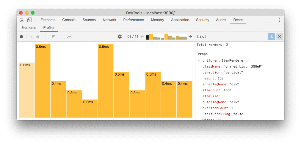
The chart above shows that the List component rendered 11 times.
It also shows that each time it rendered, it was the most “expensive” component in the commit (meaning that it took the longest).
To view this chart, either double-click on a component or select a component and click on the blue bar chart icon in the right detail pane. You can return to the previous chart by clicking the “x” button in the right detail pane. You can also double click on a particular bar to view more information about that commit.
If the selected component did not render at all during the profiling session, the following message will be shown:
Interactions
React recently added another experimental API for tracing the cause of an update. “Interactions” traced with this API will also be shown in the profiler:
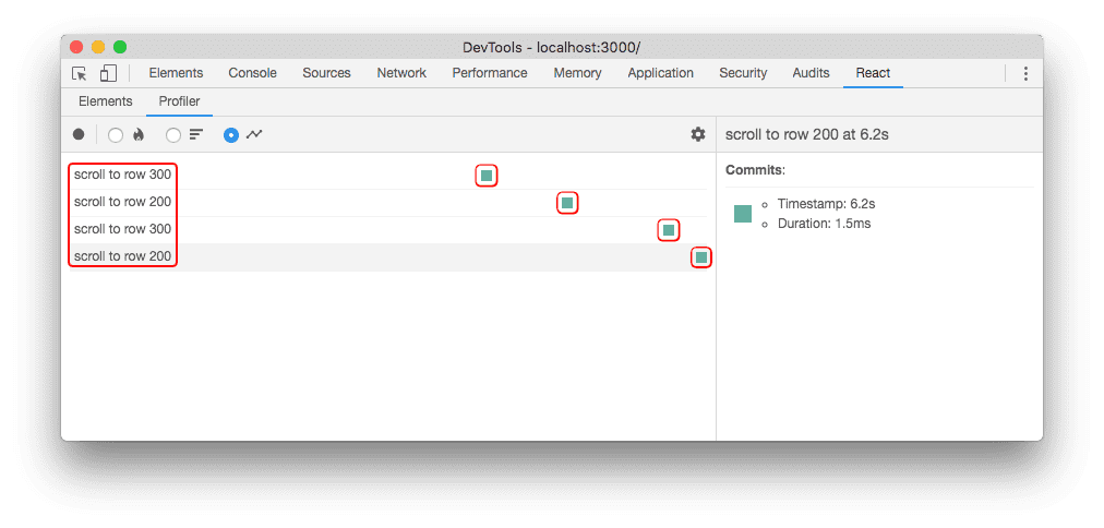
The image above shows a profiling session that traced four interactions. Each row represents an interaction that was traced. The colored dots along the row represent commits that were related to that interaction.
You can also see which interactions were traced for a particular commit from the flame chart and ranked chart views as well:
You can navigate between interactions and commits by clicking on them:
The tracing API is still new and we will cover it in more detail in a future blog post.
Troubleshooting
No profiling data has been recorded for the selected root
If your application has multiple “roots”, you may see the following message after profiling:
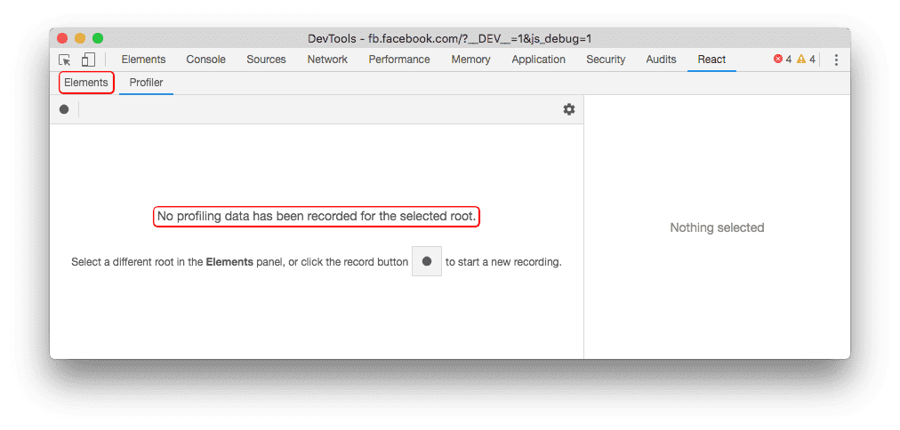
This message indicates that no performance data was recorded for the root that’s selected in the “Elements” panel. In this case, try selecting a different root in that panel to view profiling information for that root:
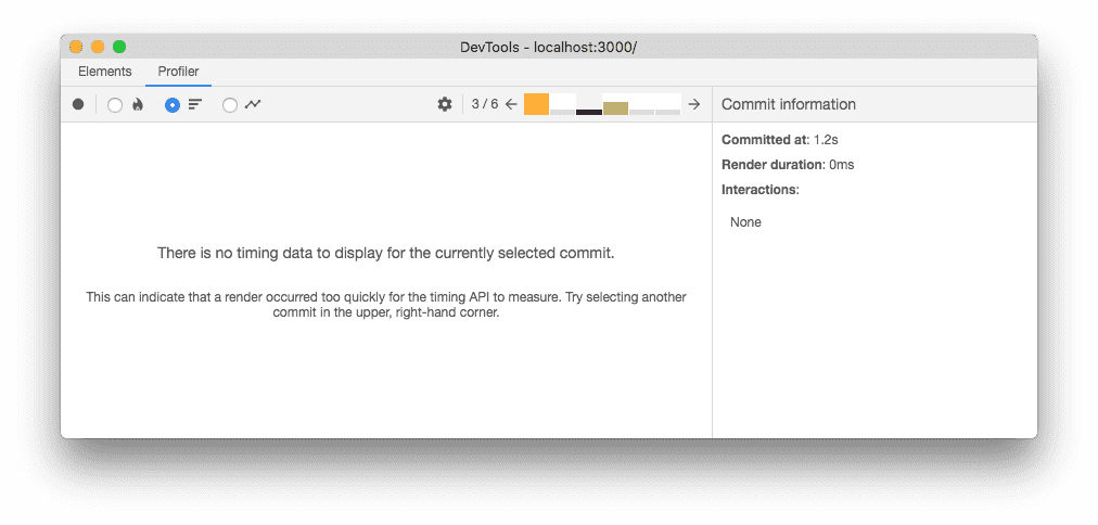
No timing data to display for the selected commit
Sometimes a commit may be so fast that performance.now() doesn’t give DevTools any meaningful timing information.
In this case, the following message will be shown:
Deep dive video
The following video demonstrates how the React profiler can be used to detect and improve performance bottlenecks in an actual React application.